The current situation in Europe, India, and Brazil each (and all) demonstrate the continuing risk of another surge in disease.
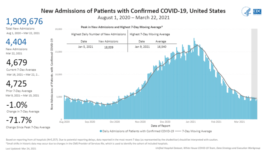
US hospital admissions related to covid continue to ease. This indicator is our most rigorous signal of covid’s “demand-pull” on the healthcare system. In my judgment fatalities, while even more rigorous, signal demand cessation or, perhaps, demand intensity.
US case counts are suggestive and worth watching, but substantially undercount actual “consumption” of covid.
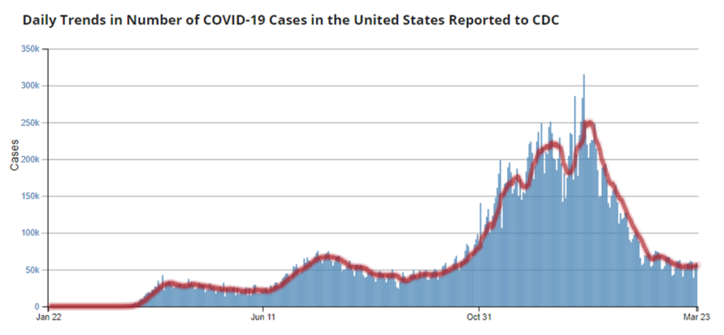
Especially in comparison with much of Europe, India, and Brazil, these US data indicators are clearly more positive. But current case counts (at least in the US with its anemic testing/tracing system) typically lag viral flows by a matter of several days. New hospital admissions typically reflect disease conditions two or three weeks prior. In either case, once case counts and hospitalizations are surging it is too late to stop the surge. Post-hoc we can only contain.
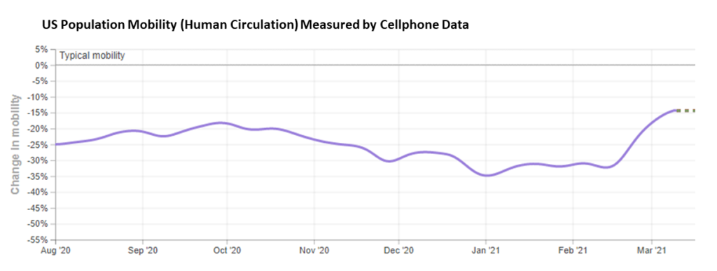
Searching for an ex ante indicator, my best — if very rough — tool has been cell phone mobility data. It has seemed to me (but much more diligent data analysis is needed) that when and where human circulation has remained at three-quarters pre-pandemic levels, covid has been much more effectively demand-managed (two-thirds is even better, the ROI beyond 2/3s has, so far, seemed negligible).
So… from a supply chain perspective, US behavior over the last three weeks is cause for concern. Can US vaccination rates mitigate the risk resulting from this increased circulation? I am much more confident that vaccinations combined with ten percent less human circulation (or even less) than shown below would avoid another demand-surge on the healthcare system in mid-to-late April.