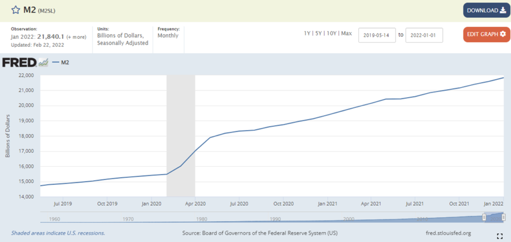
Yesterday the Federal Reserve released an updated measure of the money supply. Liquidity continues to be very high, at least one-quarter above pre-pandemic levels. For many — especially higher earning — Americans this suggests a significant buffer against (cause of?) inflation and support for continued high levels of consumption.
Demand inconsistent with pre-pandemic patterns has (in combination with other factors) challenged global and US production and transportation capacity needed to fulfill demand. Demand increases partly reflect pandemic-related shifts, for example buying more groceries to eat at home instead of eating out at restaurants or buying durable goods instead of traveling. Since Spring 2021 consumption patterns have also reflected pent-up demand embedded in a much higher than ordinary US personal saving rate.
Because most of these demand patterns are unlikely to persist, investment in expanded capacity has often not been sufficient to fill the structural gap (and non-structural adjustments have often been unstable). In cases where significant capacity expansion is underway (such as semiconductors) the additional throughput is not yet not happening — or just beginning to happen.
I have expected supply chain stress to persist until we see more equilibrium in the purchase of “services” versus “stuff” and pent-up demand is spent-down. During the second half of 2021 the US experienced significant recovery in several service-oriented sectors, but the omicron wave disrupted this progress. Still, if coronavirus infections, hospitalizations, and (many) other risks cooperate, this Spring could, even should see significant service-sector expansion.
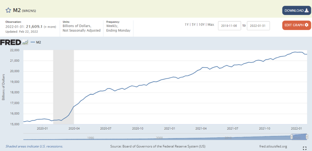
What about pent-up demand? Many economists are skeptical that the US money supply can be meaningfully measured. While I am sympathetic to the issue, the extraordinary expansion of the last two years (and potential implications) cannot be blithely ignored. Recognizing some innate limitations, below are two angles on the M2 money supply. The first chart (M2SL) shows what the Federal Reserve considers its most valid measure. The second chart (WM2NS) is a legacy measure that the Fed still reports, but considers even more troublesome than its sufficiently troublesome M2SL measure. (Here is an explanation of the difference between the two measures.) For personal — perhaps age related — reasons, I have been watching the legacy measure more closely than the other.
I like what I see in January outcomes as reported by the second chart. This is the kind of gradual spend down of cash reserves that would be best for most supply chains (and probably for the US economy). Is it happening or not, given the first chart’s continued upward curve? Well, what is measured by the second chart is happening. The first chart showing the Fed’s revised measure is “correct” given its angle of measurement. Both can be correct. Which angle is most meaningful given our current situation? That will take time to tell.
This Friday there will be an update on January Personal Consumption Expenditures. If we see the overall November-December curve continue into January, I will feel better about my nostalgic embrace of the legacy M2 measure… and the real possibility of a meaningful diminishment of demand’s unsustainable pull on supply chains. Given omicron, I don’t expect much rebalancing between stuff and services for the January PCE. But there are also tantalizing signs that the bounce-back from omicron that started in January could now be accelerating.