Most news coverage of Wednesday’s November retail sales report included something like this:
Retail sales rose modestly at the start of the holiday season, as shoppers faced rising inflation and supply shortages, and some snapped up gifts earlier. Sales at U.S. retail stores, online sellers, and restaurants rose by a seasonally-adjusted 0.3% in November from the previous month, the Commerce Department said Wednesday. That was smaller than last month’s increase in consumer prices, and a slowdown from October’s robust 1.8% sales increase. [Wall Street Journal]
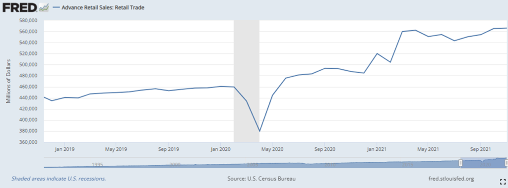
Inflation and supply shortages are not exactly blamed, but the implication — repeated again and again — is that consumers are being suppressed by higher prices and lack of supply. There is, I agree, cause to believe that Americans would have purchased even more if prices had been lower and inventories had been higher. But, at least for this supply chain guy, that angle obscures the bigger story — captured in the first chart below.
An equally valid headline would be: Americans continue buying more than ever before.
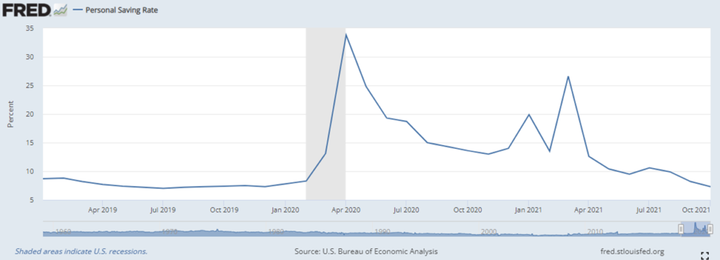
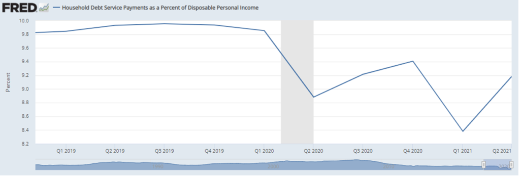
This persistent level of unprecedented demand, even as pandemic savings is being spent-off (see second chart below), is the principal cause of recent retail price increases and supply chain challenges. How long can this level of demand continue? At the end of the third quarter US household debt payments were still below historic averages (see third chart below). I bet that upward curve in debt payments has continued in the current quarter. As the saving rate declines and debt payments increase, actual retail sales will return to something much closer to pre-pandemic normal.